Let it [all] out!
– Reverend Lovejoy
Did you know that the song “Shout” by Tears for Fears is about primal scream therapy? Or at least that’s one theory. You know what makes me want to give voice to my own primal scream? Grout color cards.
These are the things I can do without.
I don’t know why grout companies even print color cards. By most accounts, they bear little relation to how the product actually looks. Most advice on the internet instructs the would-be grouter to buy a bunch of different grout colors and make a sample board.
Wait. Do you suppose the grout companies are seeding that idea online so that people will buy lots of unneeded grout? It’s the grassy knoll of tiling, people!
Conspiracy or not, I tested a bunch of grout so you don’t have to — assuming you are interested in a light-coloured grout by TEC. TEC is widely and cheaply available locally, so I decided we would use one of TEC’s colors. I don’t own TEC stock — this is strictly a limiting exercise so I don’t drive hither and yon looking for obscure grout samples for the rest of the year. One of these will do!
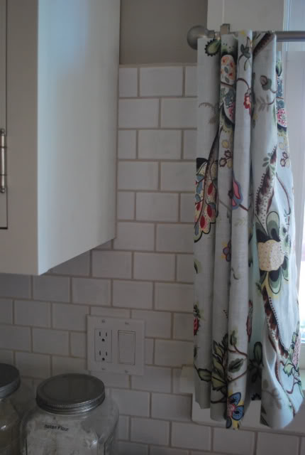
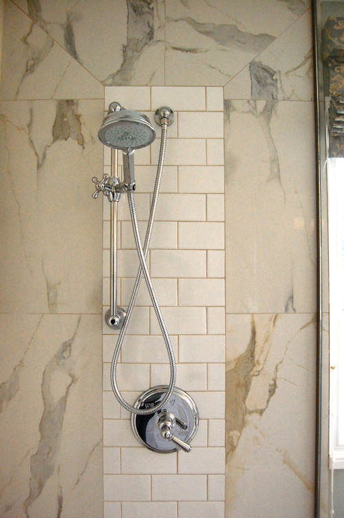
Our bathroom has TEC “Standard White” grout with white ceramic subway tiles. I mentioned in another post that I regretted white grout in the bathroom, and that’s partially true. The white grout on the walls is fine. I sealed it, and it has held up wonderfully, even in the shower (although admittedly, we don’t cook in the shower). The problem is with white grout on the floor. That, my friends, is impossible to maintain in its original state. Say no to white floor grout!
The standard white wall grout is a nice, low-contrast look with white subway tiles. Here it is sealed with about four years on it:
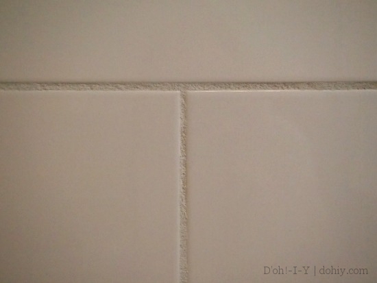
TEC Standard White Sanded Grout
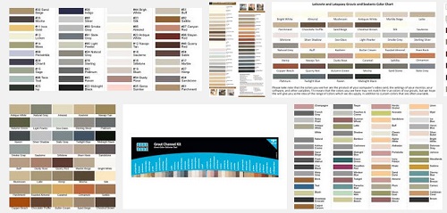
We wanted to use a neutral grout in the kitchen, but weren’t sure WHICH particular tone. We knew what Standard White looked like, and it’s easy to find photos and reviews of the popular Dove Gray and Delorean Gray online — check out this Gardenweb thread or try an image search. It was harder to find other neutral gray-to-warm-beige colors, so we slopped a few on pieces of scrap tile for your edification! (And ours. Well, mine. The Kev isn’t that bothered.)
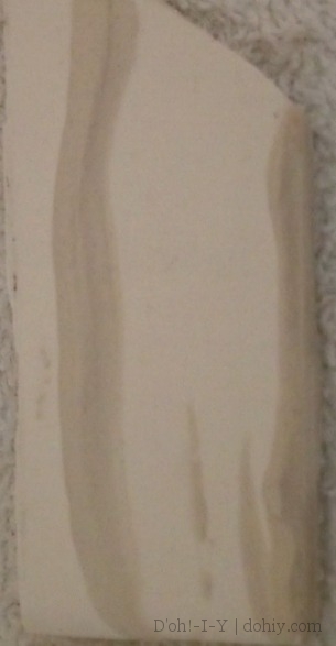
All our pictures here were taken in natural light with no flash on white glazed tile (on a white towel). The grout is fully dry and has been on the tile for at least a week. I adjusted the brightness and contrast by the same amount for all pictures, with a view to making these as close as possible to the colors my eye sees. I zoomed these in for purposes of getting the color, so apologies that the resolution isn’t great.
1. Pearl
TEC Pearl Unsanded Grout
In artificial light, this one looks off-white to palest gray, but it has a warm cast in natural light. A Gardenweb member posted the following picture of Pearl on white tile, and said that it was lighter in person a few months after installation.
(via)
2. Antique White
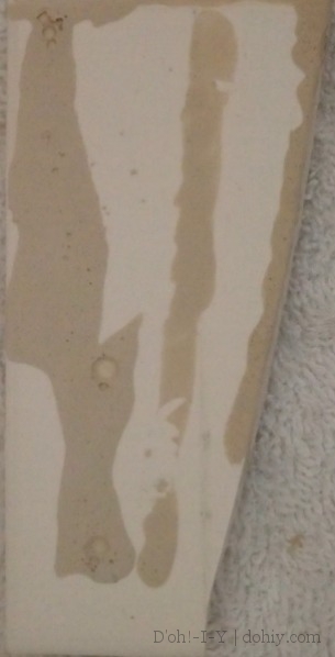
TEC Antique White Unsanded Grout
This one is more gray and darker than the Pearl in artificial light. Many tile folks and designers around the internet say that any grout maker’s antique white is a safe bet. Some homeowners say it just looks like dirty grout!
Antique white with white tiles (unspecified brand–may not be TEC) (via)
3. Almond
The most colorful grout we tried was TEC’s Almond.
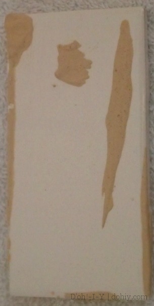
TEC Almond Unsanded Grout
Our cabinets are maple and they are stained a warm color — I think it was called “Cider” and I still really like it a decade after the remodel. My concept was that picking up a similar color in the grout would pull the wood cabinets together with the quartz counters and the white tile backsplash and everything would just be super-neat. On the TEC color brochure, Almond is the closest to the cabinet stain. On the tile, it’s fairly orange in artificial light to very pale in lower natural light. I could not find a photo claiming this exact color with white tile, but I suspect it would come out something like this:
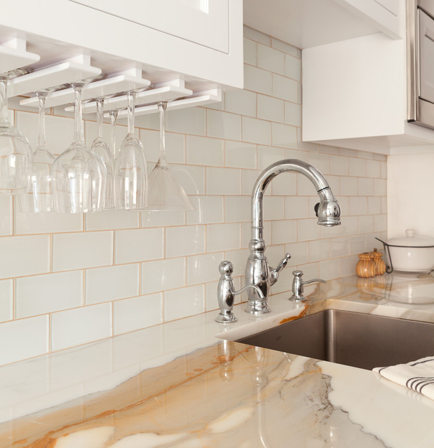
Tan grout matches the marble veining (via)
…or this:
Our “short list” includes all of these (Standard White, Antique White, Pearl, and Almond), plus Dove Gray. And our decision…isn’t made yet because I have yet to corner Kev on the issue. Any input welcome!

2 Responses to Grout. Grout.