AAAAAH!
– Homer Simpson’s Brain
In my last post on choosing paint colors, I talked about the subjective, fun part of the process — finding great colors and translating them into paint chips to pick up and play with.

If you choose not to decide, you still have made a choice. Ooooh, deep! Doesn’t Geddy Lee look unsettlingly like Doctor Who in this picture?
But at some point, you have to make a decision! And that, my friends, is less fun. Try to remember that it’s ONLY PAINT! Hate it? Repaint it!
Fact is, though, I hate painting, so I don’t want to repaint. This is how I winnow down the choices as rationally as possible to keep painting to a minimum.
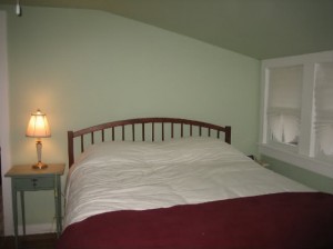
Our bedroom is currently a mid-green — not exactly a sage, but close (exact color is Mangrove Shade by Sherwin Williams). It’s time for a change, but not too much of a change — we still want green, but a different green.
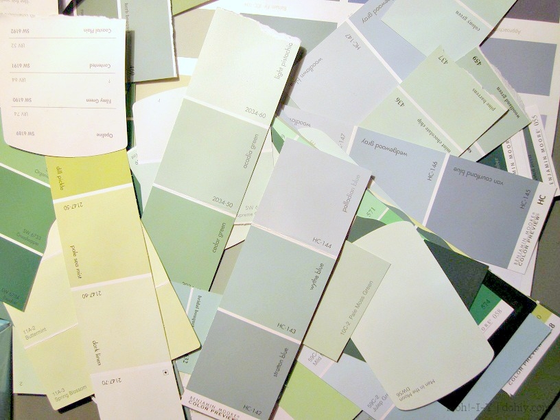
From the great mass of green colors from my bag o’ chips, we picked out the paler and bluer versions. Colors can “lean” toward the colors on either side of them on the color wheel, so greens can tend more toward the yellow or the blue. Not sure? Take your chip and hold it up against the main color. A blue-green against a pure green will look more blue, while a yellow-green will show up yellow. (It can also help to pick up chips that are on either side of your preferred chip and compare them.)
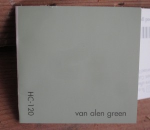
When I have some favorite chips, I take to the internet and run image searches for the paint manufacturer and color name. Colors look different in changing light and various settings, so seeing your color on actual walls is really useful. Check out this Benjamin Moore color (Van Alen Green, HC-120) that looks like a nice sedate green on the card:
And here’s how it looks in some actual rooms:
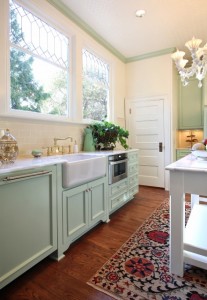
Garrison Hullinger Interior Design Inc., as seen on Houzz.com (in a sunny room)
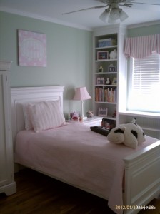
Kaleidoscope Color Consulting as seen on Houzz.com (in filtered natural light)
This is a great way to narrow down your choices. If you don’t like a color in any image, or it looks weird in a room with lighting similar to yours, then you may be able to throw it out. But remember that whoever posted the picture may have tweaked the colors in the image–the more pictures you can find for a specific color, the better idea you will have.
Alternatively, you can tweak it. Suppose I like Van Alen Green overall, but it’s a little too minty for me. Here are two websites that can help:
- Colorcharts.org Online Color Library (note that this page goes down regularly, and may not be available, but keep it bookmarked because it tends to come back eventually)
- EasyRGB.com
I can look up Benjamin Moore‘s Van Alen Green on either site and find near-match paint colors. On ColorCharts, I can find a range of commercial colors that are close to my subject, and then search for images of those colors to check. ColorCharts is also great for chip card shopping. No Benjamin Moore dealer nearby, but Home Depot is down the street? Martha Stewart’s Celadon is a 90% match for Benjamin Moore’s Van Alen Green. I’m out the door!
Easy RGB shows colors next to each other, so if I’m looking for something just a touch more green-green, I might check out Pratt and Lambert’s Placid Green. Easy RGB also gives you color themes to harmonize with your choice, which you can convert to paint names. Both sites are made of pure ginchiness.
But say you like how Van Alen Green looks in photos, and you especially like the images that most replicate the light in your room. No need to tweak! It’s time for the liveability test. Buy a sample and see how it looks in real life.
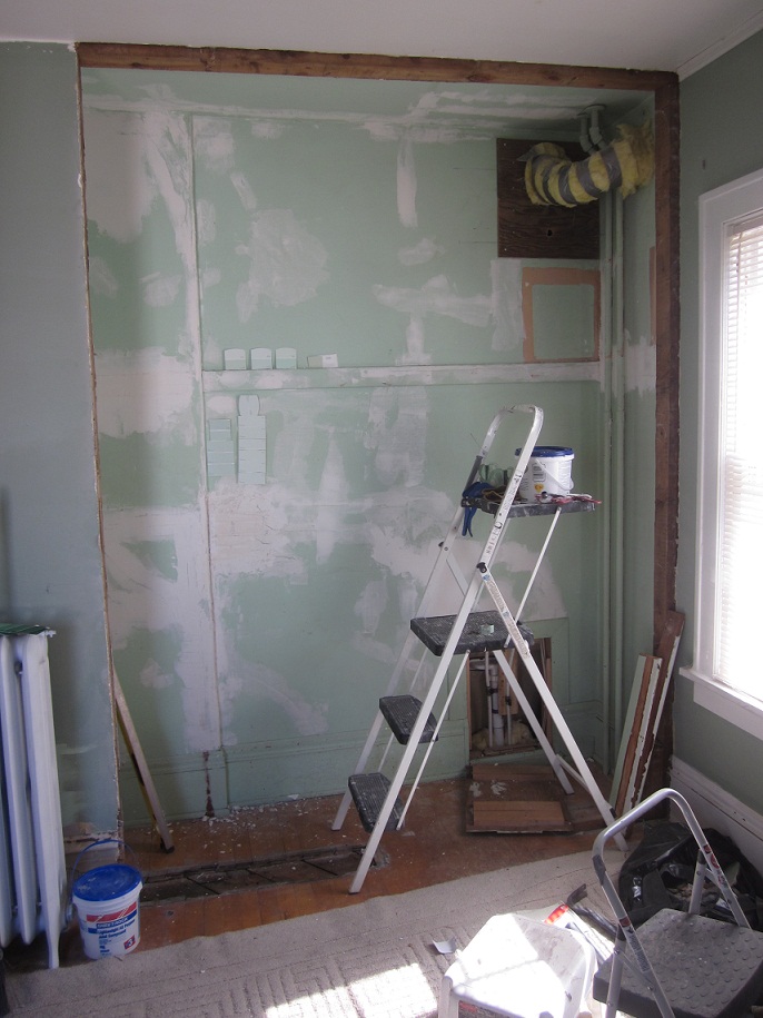
We’re not at this stage yet with the bedroom, but after I’ve done some plaster touch-ups and primed, I’ll have a clean slate unaffected by the current green paint. Then I’ll pick up samples of my three (or so) finalists and paint a reasonably big patch of each. Looking at these colors at various times of day will bring us to a decision…or let us know we need to start over.
By the way, while I’m a fan of specialty paints (particularly Benjamin Moore), I’m not a purist on samples. Last I checked, Sherwin Williams doesn’t really do samples (you have to buy a quart), and Ben Moore has tiny samples of a select number or they will do a pint. I go to Home Depot and have samples made up in Behr (also a good paint). They are big enough to paint a good area, they are about $3 each, and they have most major manufacturer’s colors keyed into their system. Color matching will not be super-precise, but it will be plenty close for decision-making purposes.
Frankly, I drive myself pretty crazy with this part of painting. I hope these tips help keep you sane in comparison. Happy painting!

