
Oh, I hate having two heads.
– Homer Simpson
Sometimes, I dislike my brain very much. It fixates on odd details. It keeps me up late, then wakes me up at dawn to tell me its latest idea.

My brain stays up late, but never makes me waffles.
And the fixation is always about something that will eventually be happily resolved without being dealt with RIGHT NOW. This week, for instance, my brain is all hepped up about tile patterns for backsplashes.
I mean, really. THIS IS TIME I WON’T GET BACK AT THE END, BRAIN.
But I have learned quite a bit about what to consider when picking a tile pattern, so that’s something! Whether you are looking at stone, glass, or ceramic, the tiles have to go up in some sort of order. Here are some things to keep in mind when you are deciding on a tile lay-out.
1. Small vs. Large Tiles
Maybe you are drawn to large-format tiles with very few seams, or maybe you like the mosaic tile sheets made of dozens of tiny pieces. Your wall might have something to say about the choice. For kitchen backsplashes (as opposed to tiled bath enclosures), you can apply tile directly to the wall without a backer board (assuming the wall is in relatively good shape). But if the wall is older, wavy plaster, a large format tile might be hard to install. Uneven areas can cause a big tile to “seesaw” and exaggerate the issue. A smaller tile or mosaic sheet won’t emphasize these imperfections as much; they follow the contours of the wall better by virtue of being smaller.
Here are some classy graphics to make the point:
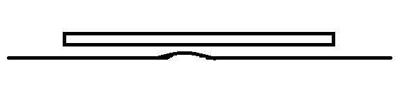

The adjacent tiles in the first case are going to be noticeably less prominent, but the smaller tiles “drape” around the problem area more closely.
If you are set on large-format and have wavy walls, you can work on the walls or use an otherwise-unnecessary backer board to give you a flat surface. (On a floor, you could use a self-leveling product, but we’re talking walls here.)
Smaller tiles do mean more grout, which means more grout cleaning. Make sure you use the right kind of grout for the project, seal it properly, and choose a color that won’t make you completely insane. (I’m still annoyed that we used white grout in the bathroom.)
2. Pattern Start and Finish
A pattern should be laid out to make sense on the wall. For instance, a chevron or angled herringbone pattern should have one of the “V”s line up behind a focal point like the cooktop or the faucet/tap. Then, the pattern proceeds outward from there.
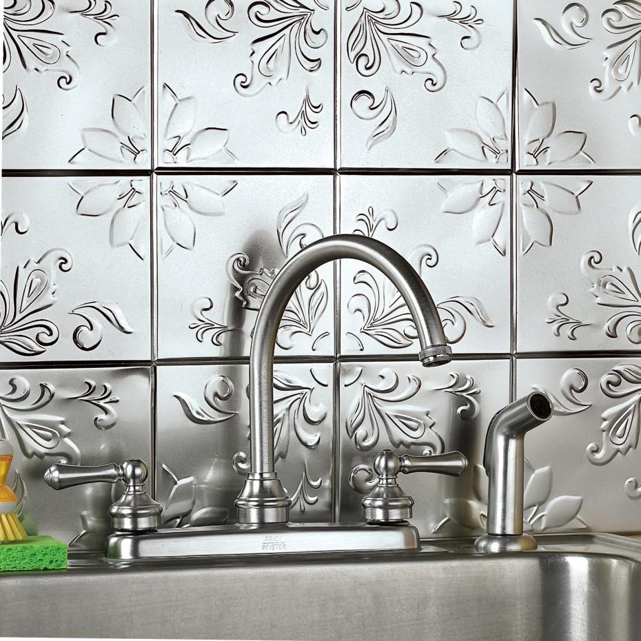
This tile is lined up so the tap is in the center of a tile, but could be lined up on the pattern instead; imagine the tile moved over a half-tile to your left so the faucet is in the middle of the embellished area (via).
But centering the pattern may mean that when you get out to the edge of the area, you’ve got a bunch of little slivers. It’s important to lay out the tile–with grout spacers–to make sure that the pattern doesn’t get ridiculous-looking at the tops and the edges. Grout spacing may take care of such problems, but keep in mind that more grout might look weird in its own way.
Square pattern showing off un-squareness, slivers, and bad tile spacing: a worst-case scenario from Ugly House Photos.
3. Pattern Scale and Effect
I’m no interior decorator or designer, but even non-designers should generally remember scale when selecting a tile pattern. Some patterns might not be right for a specific space. We were playing around with the idea of a modified hopscotch pattern, but I was having trouble finding images of such a pattern on a wall. A designer friend pointed out that there was a good reason for that–a pattern that tends to draw the eye outward (large tile to large tile) is good for a floor because it creates the feeling of a bigger space. But in a confined space on the wall like a backsplash, a pattern that draws the eye in that way could be annoying–your vision would keep crashing into the countertop or the upper cabinets. EYE WRECK!

A modified hopscotch pattern on a floor; we were going to use smaller tiles, obviously (via).
On the other hand, a pattern can help distract from other things. If nothing sits quite square in your kitchen, don’t pick a pattern full of straight lines that will emphasize the issue. Using a running bond (brickwork) pattern rather than a straight stacked installation might be enough, or something on the diagonal or a mosaic with a lot of angles could be a better choice.

Something organic like this would hide leveling problems (via). I’d spend all my time just stroking it and whispering, “Pretty! Pretty!” instead of noticing things out of square. Of course, if you can afford this tile, just have your whole house levelled already.
4. Popularity vs. Style
A more subjective issue is whether the pattern will look dated in a short time. In the age of Pinterest, trends take on sharper spikes, arguably for shorter cycles than in the past.
1970s backsplash: dated or fabulous? (via)
Ultimately, it’s just tile, but it would be nice to not have to rip it out for quite a while. You just have to go with what you love (and not what you’re told to love) for a reasonable outlay and hope for the best!
5. Installation
Earlier in this process, my overexcited brain decided that the backsplash should be a Penrose mosaic. Penrose tiling was discovered by an English physicist and mathematician (Roger Penrose), and it has all sorts of funky mathematical qualities. It also looks completely cool:
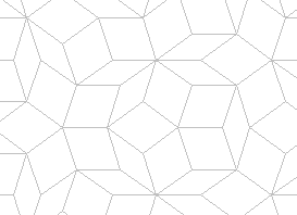
(via)
There are only two shapes in there. Really! So one night, my brain kept me up playing around with the idea of cutting standard tiles into hundreds of these two shapes, and then using a Penrose generator to make the pattern for the backsplash. Or? OR?? Making the tiles out of epoxy and painting/sealing them! Less cutting that way!

WE COULD TOTALLY MAKE THE TILES!
Saner parts of my head prevailed, though. In addition to picking a pattern that will suit your kitchen, fit the area neatly, and not immediately go out of fashion, pick a pattern that won’t make you pull out your hair when you install it. In the end, it’s just a way to keep the kitchen mess semi-contained.
With all those things in mind, here are some good resources for tile pattern names and examples:
- Daltile: Provides many patterns for one, two, and multiple tile sizes, plus examples for floors and walls.
- Crossvile Tile: Gives percentages for each tile shape/size to make given patterns.
- Tilejax: Shows several patterns and gives pointers for each, including whether grout spacing will cause pattern issues.
- Flor’s Musings Blog: Gives drawings for carpet tile layouts, but is also a good resource for tile-tiles.
- Clay Squared: Shows pictures of finished installations and provides some historical information on tile patterns.
If you have tiled your own backsplash, please comment on how you picked your pattern and whether you would do it again. Because seriously, I’m still looking for a reasonable idea!

2 Responses to Backsplash Backlash